Second Stroke: Art Direction Runners-Up~Our runners-up this week are @grornt, @helloijustreadyourpos
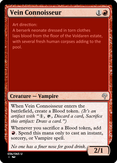
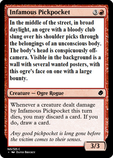
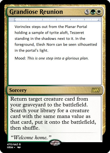
Second Stroke: Art Direction Runners-Up~Our runners-up this week are @grornt, @helloijustreadyourpost, and @horsecrash.@grornt — Vein ConnoisseurYeah, that’s pretty darn excellent mechanically. I think this was the closest pick to a winner, and I also think there are some changes I would have liked to see to make this card perfect. Let’s start with the good, though, because there’s a lot of it! It’s aggressive, it’s…frighteningly strong and unique mechanically, and it feels Innistrad-y to the max. I think it’s about time that Alara and I talk about my favorite plane, honestly, because there’s a close call to be made between the two. Whenever you sacrifice, add R… Wow. I want to see this played. I say this way too much, but when I get that innate urge to see a card in action, when I want to slam it on the table in the archetype, that’s a sign that you’ve done something not only correct, but stellar.The first change I would have liked to see would’ve been some camera work and some mood. Where is the neonate in relationship to the bodies? I’m picturing a dramatic angle, but it’s hard to understand exactly what you were visualizing here. That’s a minor me-issue, as there tends to be, but I think a little bit of specificity could have helped. With the flavor text, it’s good enough and makes the nobility contrasted with the savage art direction stand out. If I’d been in the workshop, I would have perhaps suggested a quote about a “fine vintage,” something slightly shorter/snappier, and on a totally unrelated aesthetic note I would have suggested chopping the top/bottom in the MSE Mainframe in order to separate it from the bottom a little more. Super minor changes, so DW about it too much. I’m mostly just now catching up to the fact that “spending only to cast certain spells” is the perfect tie-in with someone being a snob about their blood. Ha! Bloody brilliant.@helloijustreadyourpost — Infamous PickpocketI don’t want to say that this card is trying too hard, because it’s still doing a lot right and it made me smirk. In my opinion, there’s a little too much flavor text to be as snappy as the art direction. My main criticism is that the wordiness in conjunction with the name doesn’t emphasize the strengths of the art/mechanic combo that’s carrying this card. Replacing the word “pickpocket” with “thief” or “scoundrel” or “burglar” would have added that spice; the aural qualities of the word “pickpocket” are best not reiterated. I feel like I’m explaining this a little, uh… Academically? It’s a word that takes up a lotta bandwidth in the brain-mouth and does enough in the name not to be used in the text.Man I talked too much about that, but no matter, because it’s time for me to fawn a little over this card now. The ogre! I’m picturing him muscular because reasons. And I can see the humor in this card for sure. Is it Ravnican? Capennan? Don’t matter—it could be Fioran for all I care, and it’s flexible enough to be hilarious in all the city-esque melting pots of the world. “I’m gonna pick your pocket” is exactly what this card wants to do. A 3/3 for 4 with potential card advantage and some combat complexity is just plain hot! I think that either this was a conscious effort to do some amazing common design, or you’ve absorbed enough to fall into it, because as a draft player this card makes me just want to gush. If there’s ever an IF best-of set that uses commons and whatnot, I want this in there, because it’s just so simple but it says so much about the game. I’m not sure if I need to be as impressed as I am but I am regardless.@horsecrash — Grandiose ReunionI feel like you poked a massive hole in this contest. Quite frankly, I don’t enjoy this card. I like it a lot, but I don’t enjoy it. Mechanically? Stellar, if a bend. Name? Raises questions and piques interest. Flavor text? Sure, I can totally dig it. The art direction. I look at it and I picture it and I’m realizing just how much this is terribly terribly right. Norn is indeed white, Vorinclex is indeed green, and there’s nothing necessarily wrong about this card being a Phyrexian powerhouse in the world and some kind of story spotlight or whatever. But it feels wrong. Why? Because it breaks preconceived notions.Nuance is a b-word when it comes to talking about this kind of card. There is absolutely nothing wrong with this card whatsoever. And yet, green and white going together like this with this art has a quality that’s deliberately unsettling and no matter how much I say that it feels XYZ way there’s nothing objectively I can point to and say that it’s actually a break or a badness. Phyrexia was fairly popular for this contest, and yeah, it makes sense, because they’re a weirdly diverse range of antagonists that can make the holy seem profane, the natural seem regressive, the dutiful macabre. There’s the rub. I think that… Oh, huh. I think that if I had to make a critique, it would be that this contest was about emotional expectations that contrast without clashing. Subverted expectations leading to resonance is one thing, and this card causes discord. Is it bad? No. Is it wrong? Certainly not. I’d play it for sure. I think that I’m cowed by the discord, honestly, and you know what, props to you for making me realizing just how much this contest could be interpreted in different ways.Commentary will be done this evening once I finish pie-making.— @abelzumi -- source link
#runners-up#commentary#inventors fair


