A couple years back I was doing design work for a MUGEN team to make Capcom vs SNK 3, and have it no
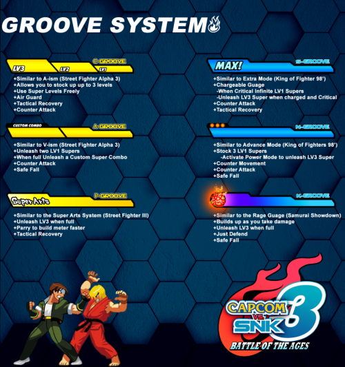
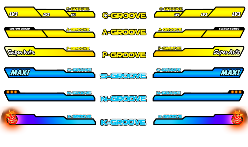
A couple years back I was doing design work for a MUGEN team to make Capcom vs SNK 3, and have it not be sum tacky half ass fan game but have a fully finished proper game. I came into the project with the goal of just making everything look cooler.-The infamous logo I just built off of the one that was put out as an April fool’s joke changed the 3 and made it shinier. Fun fact the 20XX was a place holder til we secured a legit drop date.-I did a proof of concept Marquee just to see what it’d look like on a cabinet.-I pushed for revamping the groove system, there was talks of adding new ones but I pushed for just keeping the 6 and maybe adjust the mechanics and tweak them. I wanted a cleaner a sleak look that kept CVS2′s flavor so I made the CAP groove bars yellow and the SNK groove bars blue. This was dropped later on for the “UNIVERSAL” system that mixed the best of them all.-One little detail I wanted was a new MUGEN system logo, this one mimics the NAOMI logo in color and font, I even animated it for game intros. -- source link
#capcom#gaming#game design


