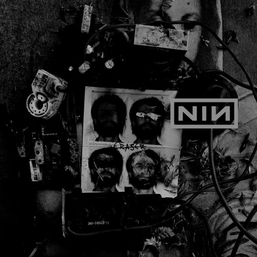
NINE INCH NAILS - THE DOWNWARD SPIRAL GRAPHIC DESIGN - SINGLE ARTWORKTRACK 11: ERASERI had play
NINE INCH NAILS - THE DOWNWARD SPIRAL GRAPHIC DESIGN - SINGLE ARTWORKTRACK 11: ERASERI had played around with a few ideas for logo and title placement after selecting the image I was happiest with, and I settled on the one up top.I like the placement of the logo and how there is a thick wire underneath it that looks as if it is holding it up. I also like how the ‘Eraser’ title is subtly in the centre of the image, and looks as if it is hand written on the photoset. I did indeed hand write the title for this one, as I thought it was appropriate given the title of the song. I flirted with the idea of doing an actual erased version, however when I used a graphite pencil to fill in a page and erase letters and words into it, the lines just weren’t thin enough and it looked sloppy. The compensate, instead of ‘erasing’ the word eraser, I simply drew a line through it making it look as if it had been crossed out. I’m happy with the way this cover turned out, I think it suits the song and is rich with meaning. -- source link
#graphic design#layout#album artwork#lsadgraphicdesign#eraser


