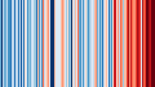
Professor Ed Hawkins’ data visualisation, Warming Stripes!It started at Hay Literary Festival.
Professor Ed Hawkins’ data visualisation, Warming Stripes!It started at Hay Literary Festival. Professor Ed Hawkins was trying to find a way to communicate climate change to an audience that might not be able to interpret scientific graphics or data.Those stripes — shades of red and blue representing hot and cold temperatures — chart temperature changes from 1850 to 2018, running from left to right. They look like a bar code, albeit a vibrant one with a serious message. Hawkins, a professor of climate science at the University of Reading, says that the impact was immediately obvious.That data visualisation was based on local temperatures for the festival’s location in rural Wales. Since the 2018 festival, Hawkins has worked on a graphic for global temperatures. Most recently, it took centre stage at a very different festival: as the backdrop for Enter Shikari’s set at Reading.On 21 June 2019, the summer solstice, he launched a website where users can view and download climate stripes for the cities they live in, from Vienna to Verona. So far there have been more than a million downloads.Warming Stripes from 1850-2020 for GLOBE / Europe / Asia / North America.Courtesy: https://showyourstripes.info/ & designweek.co.uk/ -- source link
#showyourstripes#ed hawkin#visual#global warming#climate change#climate disaster#climate emergency#humanity#sustainability#ecology#humanresources#humanrights#design#barcode#america#europe#designweek#stripes


