So here’s my tip of font using in graphic design. I made this list of fonts I suggest to be used mor
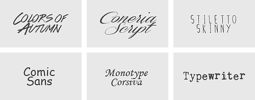
So here’s my tip of font using in graphic design. I made this list of fonts I suggest to be used more often and fonts I suggest to be used less often. Especially from Helvetica to Gill Sans, they are really popular fonts to be used by professional designers. They all work finely whether in graphic design, web design or typography.From Rockwell to Parisish, they are fonts to be used in typography or artworks, mostly for vintage style. They are probably not suitable in some formal occasions. But they will be your good choice when you want to make a fancy coffee shop banner.You might be surprised that Arial and Times New Roman are in my less used list. But don’t stop using them in your homework and essay- well, now you probably understand why you shouldn’t put them in your graphic works.The rest of the fonts are what I constantly see people using in their graphic works and I must say that even tho those fonts look cool and fancy, they actually don’t look as quality as you think.BUT, that doesn’t mean you should delete these fonts from your computer (oh but delete Comic Sans for God’s sake) They can still be used for certain situation, as long as you handle them well. However, please never do something like using Colors of Autumn as the title and Typewriter as the concept, unless you’re trying to drive someone crazy. -- source link
#fonts


