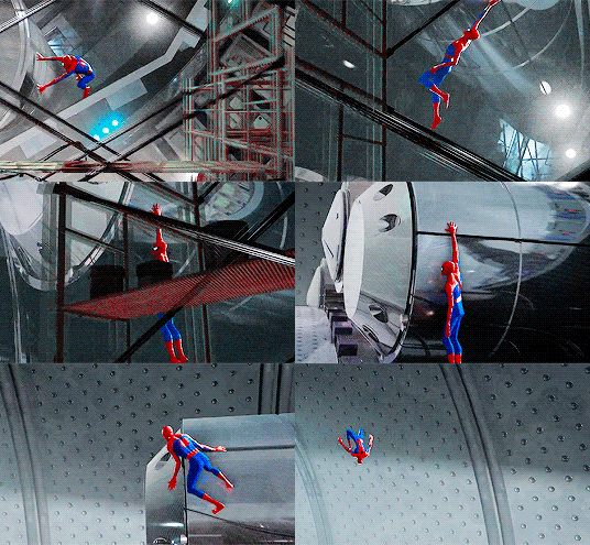
joasakura: blindstargazer:professorsparklepants:xxtc-96xx: I didn’t realize ;-; Okay I reb
joasakura: blindstargazer: professorsparklepants: xxtc-96xx: I didn’t realize ;-; Okay I reblogged this before BUT the visual contrast between the first scene and the second one is fantastic. The first sets Peter’s vibrantly multicolored suit up against the black & white colors of the reactor; the second does the same thing, but switches the palettes. Now the background is in reds and blues and Miles’ suit is the black and white. And he still catches the eye in a screen full of moving parts. THIS MOVIE, GUYS. It’s Miles standing out against the colors of the original Spider Man. this remains a masterclass in How to Make a Comic Book Movie -- source link


