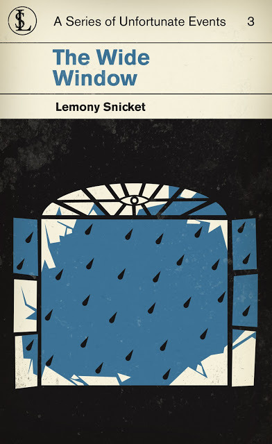
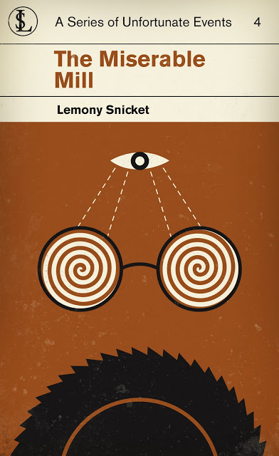
A Series of Unfortunate Events - M S Corley: American illustrator and designer M S Corley reimagined
A Series of Unfortunate Events - M S Corley: American illustrator and designer M S Corley reimagined HarperCollins ‘A Series of Unfortunate Events’ in 2009, his aim was to give these modern children’s novels a classic look. Throughout the graphic system that Corley has created, in every book cover the VFD’s (Volunteer Fire Department) symbol of an eye takes a prominent role, this is an important plot point that binds all 13 books together. Much like the movie posters of the 1960s where Corley finds inspiration, major plot points are suggested throughout the system, yet nothing is given away. The bold colours set each book apart from one another, and play out as a retro homage to the work of Penguin Books and Saul Bass through the 60’s. To see more from M S Corley on his blog, including the rest of the Unfortunate Events book covers, click here. -- source link
#visual communication#visual#graphic system#graphic#graphic design#design#designed#designer#saul bass#penguin#penguin books#lemony snicket#colour#colour scheme#color scheme#violence#editorial design#editorial#book cover


