Télémaque is a Didot-style typeface I’ve designed with the help of the great FontYou team.This
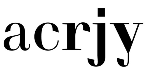
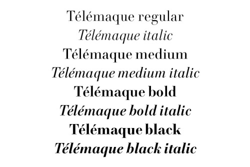
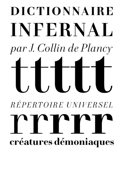
Télémaque is a Didot-style typeface I’ve designed with the help of the great FontYou team.This modern face is my attempt to design a contemporaneous Didone that doesn’t look back on the past while retraining the neo-classical elegance of the genre. Some unusual shapes like the cut terminal balls or the y à la Pierre Didot give to the family a a more graphic line. The same spirit led the removing of the serif of the middle stem on the E and F, and the unusual squared dot of the i and j.Despite these radical design choices and a strong verticality, the serifs are not perfectly horizontal to avoid the caricature of a Didot, and gives warmth to the letters. The Didot’s faces are not purely geometric or pre-bauhaus constructed types, they are grounded in the history of calligraphy: a good Didone must retains un je ne sais quoi from it in order to avoid the parody. It was the ideal of Télémaque: classic in its skeleton while graphic in its shapes. -- source link
#typography#typeface#graphic design


