Los Angeles LakersSince moving out west in 1960, the Lakers have become the team most synonymous wit
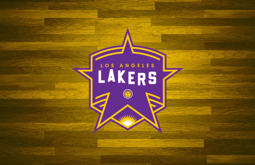
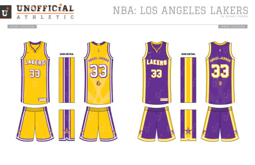
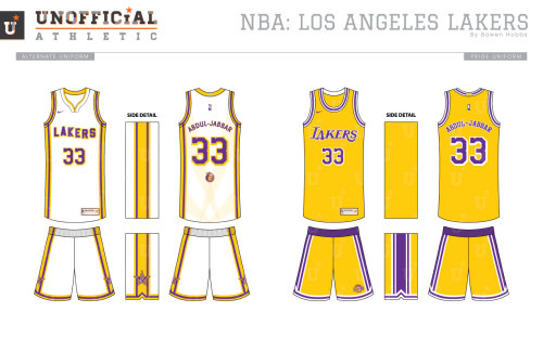
Los Angeles LakersSince moving out west in 1960, the Lakers have become the team most synonymous with Hollywood and its culture. Stars such as Jack Nicholson, Leonardo DiCaprio, Ice Cube, and at least half of the Red Hot Chili Peppers are noted fans who can regularly be found at Staples Center. And while the faces in the stands may change with time, the logo hasn’t. That said, I wanted to move the Lakers’ visual identity toward honoring one of their most passionate fan bases. My primary logo combines a Walk of Fame star and a banner (16 NBA Championships to-date) as the basis for the mark. A sun at the bottom of the banner references the Golden State, while the script plays off one of the most iconic signs in the world. At smaller sizes, the primary drops the LOS ANGELES for legibility, and an LA-Star icon is used in the most miniature of spaces. The secondary features a giraffe which the team hasn’t used in La La Land since the earlier 60s. Lastly, an updated version of the classic mark rounds out the logo set. The uniforms feature several updates on the classic. White type is used for both the numbers and the team name on the Icon and Association editions and is complemented by a drop shadow that gives letter added dimension as a subtle nod to the sign. The backs of the jerseys feature sublimated spotlights so every player can be ready for Showtime. Speaking of Showtime, the Pride uniforms throw back to those very 1980s Lakers with a classic design. The court celebrates the Lakers culture as well with spotlights behind the team name on each baseline while the sideline features a Walk of Fame complete with each of the Lakers’ 16 NBA Championships getting its very own star.unofficialathletic.com -- source link
#la lakers#showtime#basketball#artwork#illustration#graphic design#designs#redesign#creative#concept


