accessibilityfails: studyinthemoon: assemble-the-fangirls: nonelvis: kleinsaur: decodering: Dos and
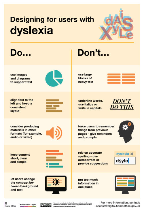
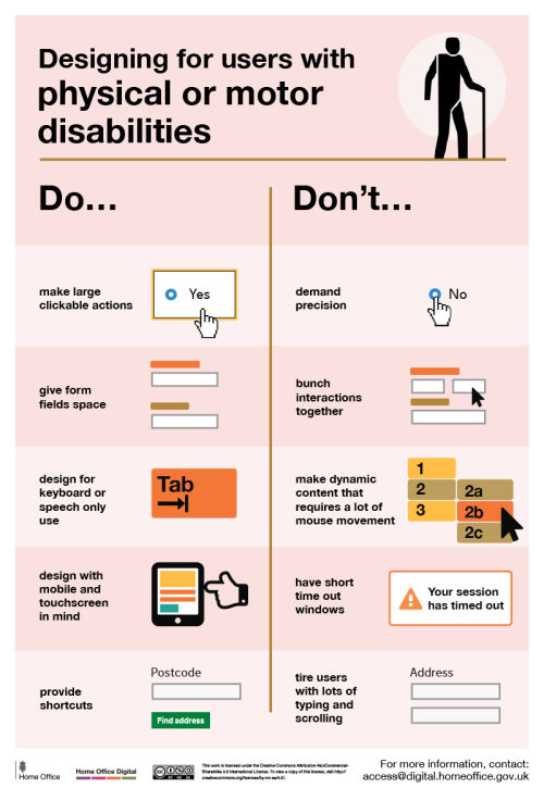
accessibilityfails: studyinthemoon: assemble-the-fangirls: nonelvis: kleinsaur: decodering: Dos and don'ts on designing for accessibility Karwai Pun, GOV.UK: The dos and don’ts of designing for accessibility are general guidelines, best design practices for making services accessible in government. Currently, there are six different posters in the series that cater to users from these areas: low vision, D/deaf and hard of hearing, dyslexia, motor disabilities, users on the autistic spectrum and users of screen readers. […] Another aim of the posters is that they’re meant to be general guidance as opposed to being overly prescriptive. Using bright contrast was advised for some (such as those with low vision) although some users on the autistic spectrum would prefer differently. Where advice seems contradictory, it’s always worth testing your designs with users to find the right balance, making compromises that best suit the users’ needs. [github] I’ve been wanting something like this to reference! Boosting for the others that like to dabble in code/design. This is some of the most lucidly written accessibility advice I’ve seen. Making accessible web pages should be the default, not an add-on. It’s really not that hard to do, especially when you think about it from the start – and it benefits everyone. (Obligatory note that there are exceptions to some of these guidelines, e.g., “bunching” some interactions together is an important way to cue which interactions are related to each other, but that’s why these are guidelines, not absolute rules.) young web designer: thank you oh my god no one has been able to explain this quite as well and this is just good shit [Images descriptions from https://accessibility.blog.gov.uk/2016/09/02/dos-and-donts-on-designing-for-accessibility/ Designing for users on the autistic spectrumDouse simple colourswrite in plain Englishuse simple sentences and bulletsmake buttons descriptive - for example, Attach filesbuild simple and consistent layoutsDon’tuse bright contrasting coloursuse figures of speech and idiomscreate a wall of textmake buttons vague and unpredictable - for example, Click herebuild complex and cluttered layouts Designing for users of screen readersDodescribe images and provide transcripts for videofollow a linear, logical layoutstructure content using HTML5build for keyboard use onlywrite descriptive links and heading - for example, Contact usDon’tonly show information in an image or videospread content all over a pagerely on text size and placement for structureforce mouse or screen usewrite uninformative links and heading - for example, Click here Designing for users with low visionDouse good contrasts and a readable font sizepublish all information on web pages (HTML)use a combination of colour, shapes and textfollow a linear, logical layout -and ensure text flows and is visible when text is magnified to 200%put buttons and notifications in contextDon’tuse low colour contrasts and small font sizebury information in downloadsonly use colour to convey meaningspread content all over a page -and force user to scroll horizontally when text is magnified to 200%separate actions from their context Designing for users with physical or motor disabilitiesDomake large clickable actionsgive form fields spacedesign for keyboard or speech only usedesign with mobile and touch screen in mindprovide shortcutsDon’tdemand precisionbunch interactions togethermake dynamic content that requires a lot of mouse movementhave short time out windowstire users with lots of typing and scrolling Designing for users who are D/deaf or hard of hearingDowrite in plain Englishuse subtitles or provide transcripts for videouse a linear, logical layoutbreak up content with sub-headings, images and videoslet users ask for their preferred communication support when booking appointmentsDon’tuse complicated words or figures of speechput content in audio or video onlymake complex layouts and menusmake users read long blocks of contentdon’t make telephone the only means of contact for users Designing for users with dyslexiaDouse images and diagrams to support textalign text to the left and keep a consistent layoutconsider producing materials in other formats (for example, audio and video)keep content short, clear and simplelet users change the contrast between background and textDon’tuse large blocks of heavy textunderline words, use italics or write capitalsforce users to remember things from previous pages - give reminders and promptsrely on accurate spelling - use autocorrect or provide suggestionsput too much information in one placeEnd of images descriptions] Someone asked about this a while back. I can’t remember their username to tag them but hopefully they see this post. -- source link


