I do not like this comic art. I do not like it in my shopping cart. I do not like it when I fart. No
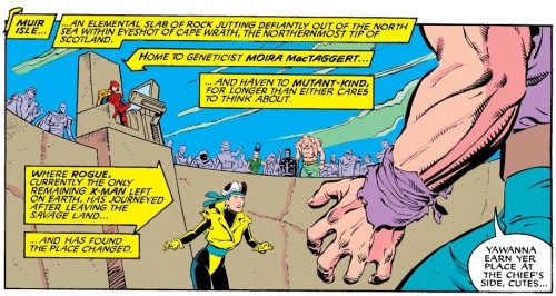
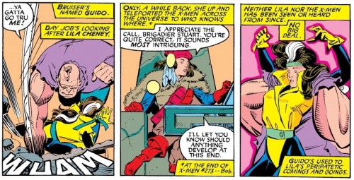
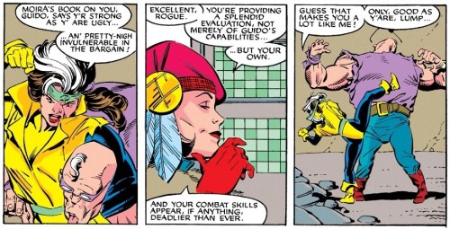
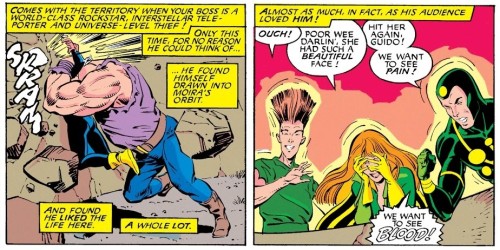
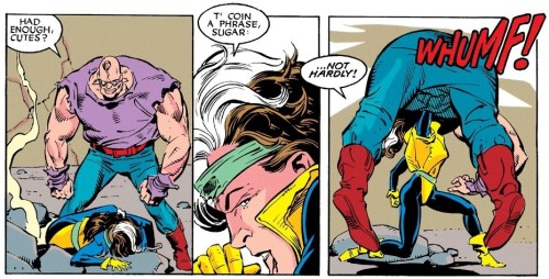
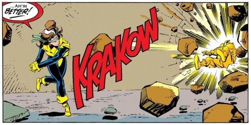
I do not like this comic art. I do not like it in my shopping cart. I do not like it when I fart. No, I do not like this comic art. Paul Smith is one of the greatest X-Men artists of all time, but dang, after the last few issues drawn by Jim Lee, which had extremely dynamic layouts and eye popping detail that was practically jumping off the page, these panels feel like they were drawn in the 1960s. Bland, straightforward, and derivative. While I’m enjoying the beginning of this new story and am looking forward to the long awaited resolution of the Shadow King plot line, this all feels awfully disjointed from the previous few issues, and not just in its aesthetic design but also in its continuity as well. For instance, how did Guido get here? How did Rogue get here, for that matter, and where did she get a clean uniform? She’s been wearing the same stained rags for her entire jungle adventure in the Savage Land which lasted for months. Same goes for Moira who has been dressing super provocatively for the past several dozen issues or so (or so we’ve been told) but is now wearing some kind of Scottish tribal chieftain uniform or something. And where did this gladiator arena come from? We just visited Muir Island to murder Proteus and things hadn’t yet devolved into Mad Max in Thunderdome. Not impressed with this continuity at all. (Uncanny X-Men #278 – July 1991) -- source link
#xmfbte#clare5#uncannyxmen278#moira mactaggert
